The Product:
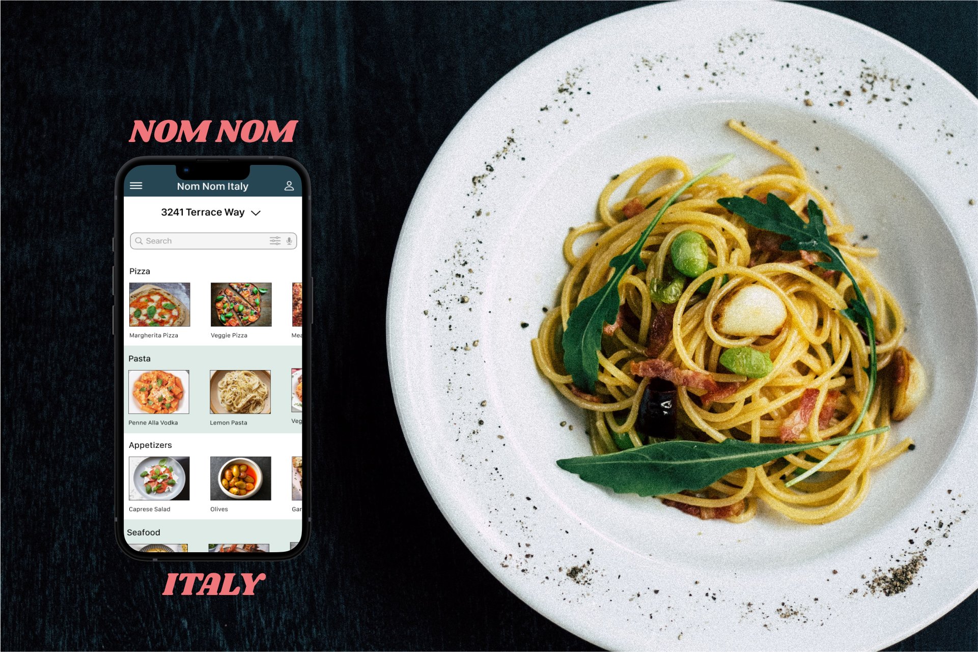
Nom Nom Italy is a local Italian restaurant located in the suburbs of a metropolitan area. Nom Nom Italy strives to deliver healthy, authentic, and tasty Italian dishes. They offer a wide spectrum of competitive pricing. Nom Nom Italy targets customers like commuters and workers who lack the time or ability to prepare meals.
Project Overview
Role:
UX Designer
UI Designer
Project Duration:
Sept 2022 - Dec 2022
Responsibilities:
User Researcher
Wireframing
Prototyping
Design implementation
Interviews
The Problem:
Busy professionals and adult students lack the time necessary to prepare meals for themselves or for others during the work week.
The Goal:
Design an app for Nom Nom Italy that allows users to quickly and easily order and pick up fresh and healthy Italian dishes.
Understanding the User
User Research
Personas
Problem Statments
User Journey Maps
User Research: Summary
I conducted an initial round of interviews. With that information, I created my first empathy map to better understand the end user’s goals and frustrations. The primary user group identified through research was adults who don’t have a lot of time in their schedules to cook meals.
The initial user group confirmed my assumptions about Nom Nom Italy’s customer base. During the interviews, it was clear that time was the main limiting factor to home cooking. I also discovered new user problems, including language barriers, transparency from the food vendor, and money constraints that make it challenging to get groceries and food in person.
User Research: Pain Points
Adults don’t have a lot of free time to spend cooking meals.
Food delivery apps don’t always have the option to change the language.
Hidden fees make ordering from food delivery apps less attractive.
Delivery/pick-up times can be inconsistent which results in poor quality food.
Persona: Zareen
Age: 34
Education: Business
Hometown: Rome, GA
Occupation: Project Manager
Goals
Network with other coworkers
Maintain a healthy work-life balance
Focus on their job and less on meal planning
Frustrations
Finding healthy options
Having to pay a lot of delivery fees
Larger orders tend to have more quality errors
Zareen has a B.A. in Business Administration and hopes an internship will launch her career in project management. Even though Zareen most enjoys the time spent working with her mentor on a campaign, she also enjoys doing other tasks like getting food for the office. She feels these tasks are a good opportunity to network and to demonstrate being a team player with keen attention to detail.
Persona: James
Age: 21
Education: Enrolled in classes
Hometown: Mexico City, Mexico
Occupation: Student
Goals
Focusing on his schooling
Taking care of his mother and little sister
Exploring the different foods in his neighborhood
Frustrations
Shopkeepers speak too fast
Lack of translations makes him anxious
Delivery times are inconsistent
Poor food quality
Joseph is a recent immigrant to the United States who is enrolled in online college classes and is also taking classes at a night school for learning English. He can read English well, but sometimes encounters difficulties at restaurants or while out running errands, where shopkeepers tend to speak very quickly and limited translation options are available. Joseph is passionate about sports and the outdoors and wants to explore what his neighborhood has to offer.
Problem Statements
Problem Statement - Zareen:
Zareen is a busy project manager who needs quick access to healthy and affordable foods because she doesn’t have time to cook meals for herself at home.
Problem Statement - James:
James is an ESL student who has trouble getting meals because there are no translated or universally understood menus.
User Journey Map
Being able to map Zareens user journey revealed how useful having a dedicated Nom Nom Italy app would be to a wide variety of users.
Starting the Design
Paper Wireframes
Digital Wireframes
Low-fidelity Prototype
Usability Studies
User Flow
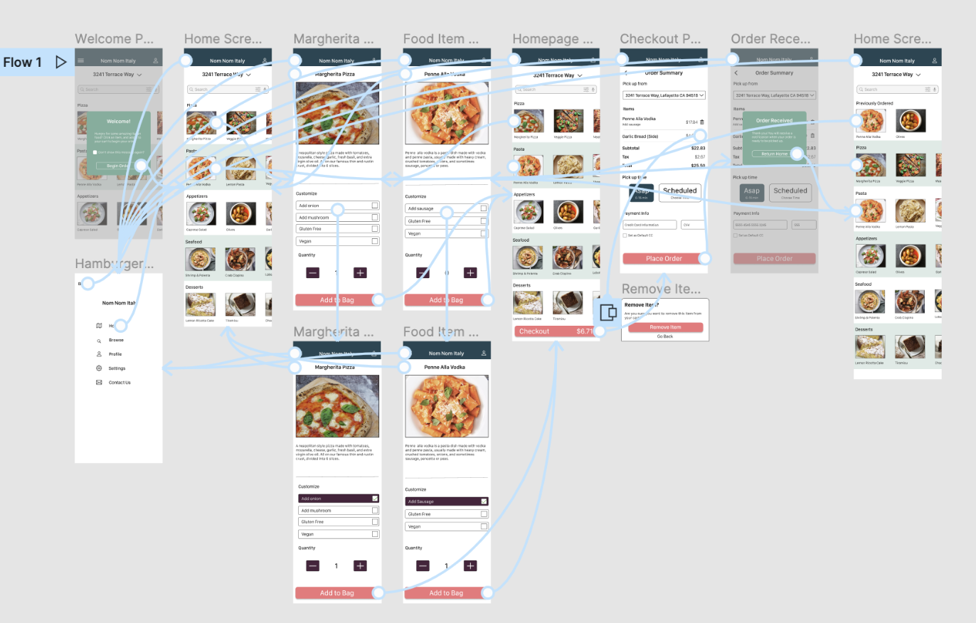
To achieve the goal of creating an intuitive and familiar design, I mapped a user flow that emphasized recognition over recall. This was done by creating a path that is already familiar to the users.
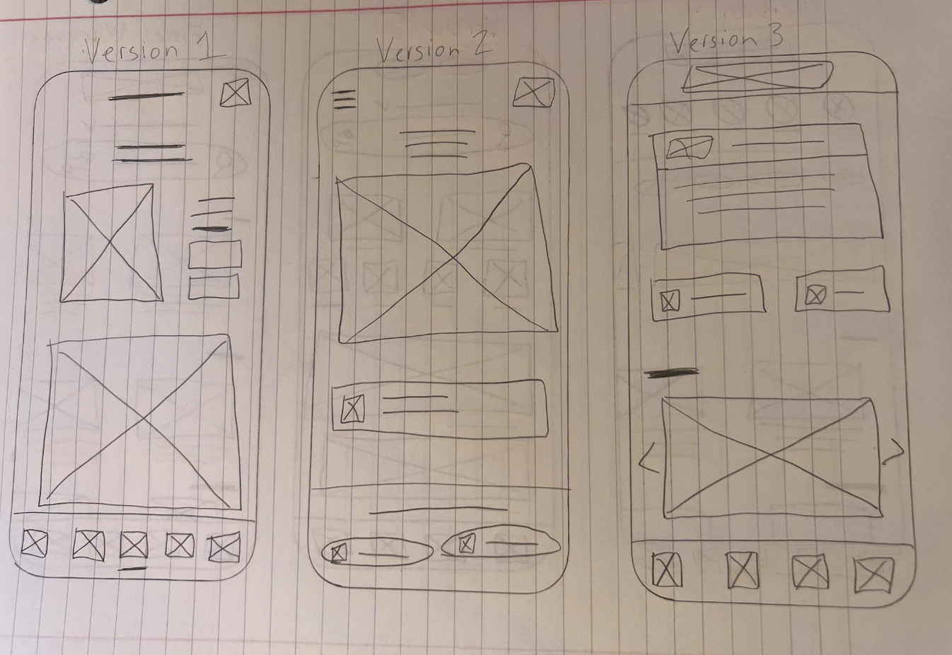
Paper Wireframes
Taking the time to draft multiple iterations of each screen of the app made sure that all of the elements that made it to the digital wireframes would be best suited to address user pain points. For the home screen, I prioritized a quick and easy ordering process to help users save time.
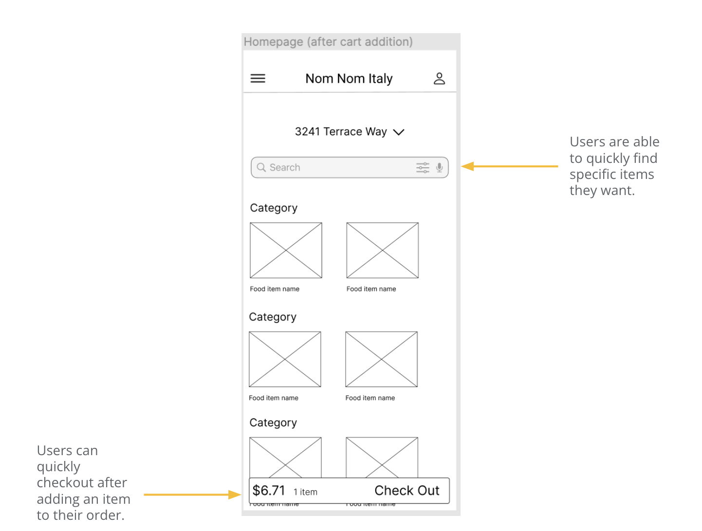
Digital Wireframes
Being able to quickly place an order was important to users. So all aspects of design were built around convenience and speed for the user.
Digital Wireframes (cont)
Easy navigation was another key user need to address in the designs in addition to equipping the app to work with assistive technologies.
Low-fidelity Prototype
The low-fidelity prototype connected the primary user flow of creating and ordering a food item(s), so that the prototype could be used in a usability study with users.
Usability Study: Findings
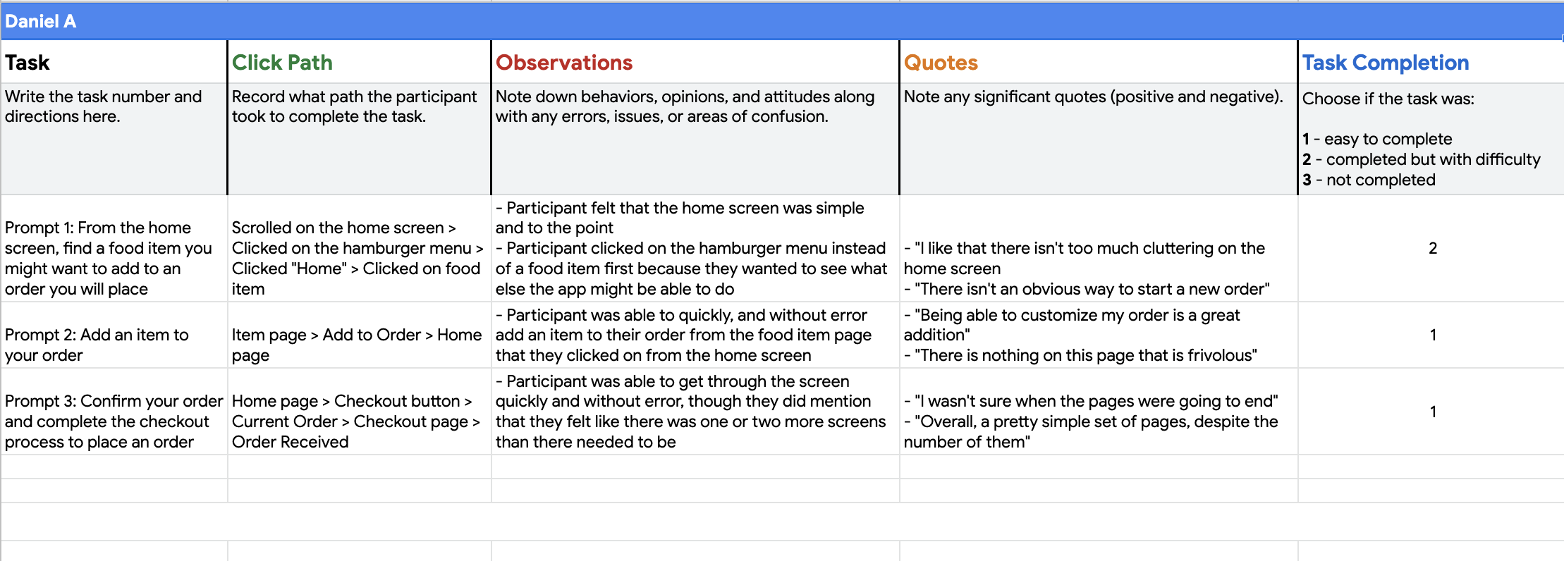
Two rounds of usability studies were conducted. Findings from the first study helped to guide the designs from wireframes to mockups. The second study used a high-fidelity prototype and highlighted which aspects of the mockups needed to be refined.
Round 2 Findings:
Users need an easy way to get back to the Home Screen from Item Page
Users need less cognitive load during checkout
Users want a “Past Orders” category added to the home page.
Round 1 Findings:
Users need clear CTA’s
Users want to be able to undo any action
Users want to be able to place an order as quickly as possible
Refining the Design
High-fidelity prototypes
Style Guide
Accessibility
Usability Studies
Mockups
Mockups
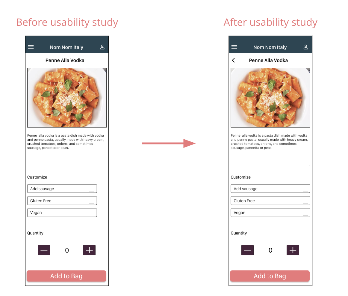
The second round of usability studies showed that a critical feature was missing from the initial item page. Users were not able to move back to the home page without having to go through the main menu. A back carrot was added to allow for easier navigation.
Users also felt that the two screen checkout flow was too long. In order to increase conversion, I combined both screens into one “Order Summary” page.
Final Mockups
Style Guide
Accessibility Considerations
Provided access to users who are vision impaired through adding alt text to images for screen readers.
Familiar use of icons helps the user navigate the app easier.
Used detailed and accurate imagery for all dishes to help all users better understand the designs.
Going Forward
Next Steps
Let’s Connect
Takeaways
Takeaways
Impact:
The app makes users feel like Nom Nom Italy really thinks about how to meet their needs. A key part of designing products is interacting with users early and often and even the smallest changes can have a huge impact on the product as a whole.
One quote from peer feedback:
“The app made placing a pick-up order so easy and fast! I would use this app as a go-to for a delicious, fast, and healthy meal.”
What I learned:
While designing the Nom Nom Italy app, I learned that the first ideas for the app are only the beginning of the process. Usability studies and peer feedback influenced each iteration of the app’s designs.
Next Steps
Conduct another round of usability studies to validate whether the pain points users experienced have been effectively addressed.
Conduct more user research to determine any new areas of need.
Further tweak and iterate on page layouts and general IA.
Let's Connect
Let's Connect
Thank you for your time reviewing my work on the Nom Nom Italy app!
If you’d like to see more or get in touch, my contact information is provided below. And feel free to visit my full Contact Page for an even better idea of the type of designer that I am.
Email:
nick.mitch89@gmail.com
Website:
nickmitchellportfolio.com
Phone
(650) 438-6383
