What is CareConnect?
CareConnect is a private network of trusted babysitters and caregivers in your area that allows you to easily find, book, and pay local sitters.
User Challenge:
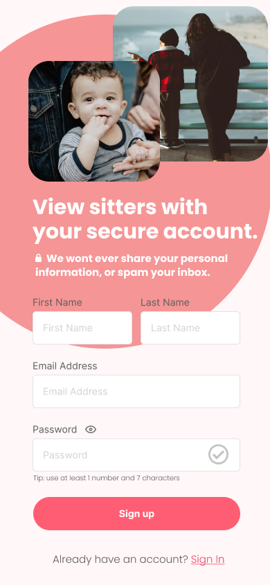
For security reasons, CareConnect requires users to sign up for a free account before viewing babysitters in their area.
Project Overview
Challenge Impact:
This is a "speedbump" for users, and analytics show that many of them drop off at this point.
User Research: Key Findings
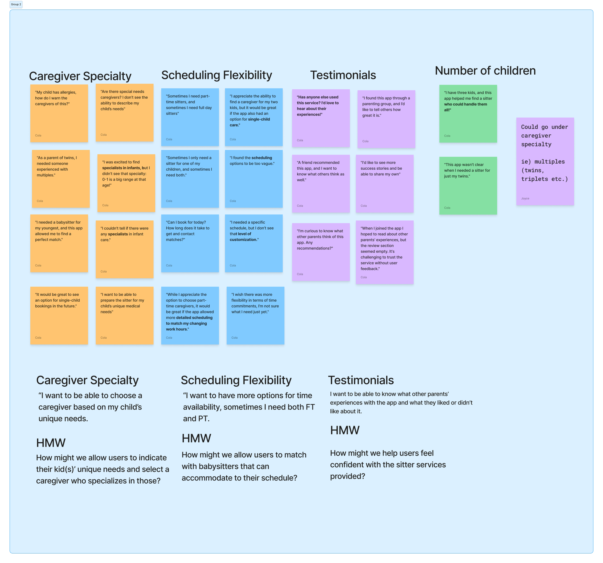
User research testimonials were completed prior and I organized the testimonials into categories and then developed themes based on these findings.
Feedback Themes
Theme #1: Lack of flexibility in time commitment from potential sitters.
Theme 2: Users struggled with finding sitters who fulfill their unique needs.
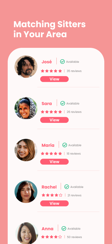
Theme 3: Users unsure of specific sitters because reviews are not featured.
User Research: Key Takeaways
Other sites boldly display their work force to users to give users more confidence in who they hire.
Users want to be able to select multiple kids, as well as have a way to communicate their children's unique needs to a sitter.
Users want to have more flexibility when it comes to scheduling a sitter.
Rapid Sketches
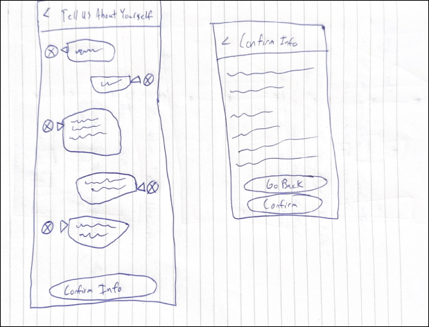
I sketched several new versions of the sign up screens to show ways to layout prioritized redesigns from my research.
Top Left: Using an onboarding method that is disguised as an automated chat (similar to how Lemonade Insurance onboards their users).
Top Right: Emphasis on a banner image with minimum amount of screens for the user to go through.
Bottom: Focus on the user being able to be more granular in letting CareConnect know what their specific needs are.
Competitive Analysis
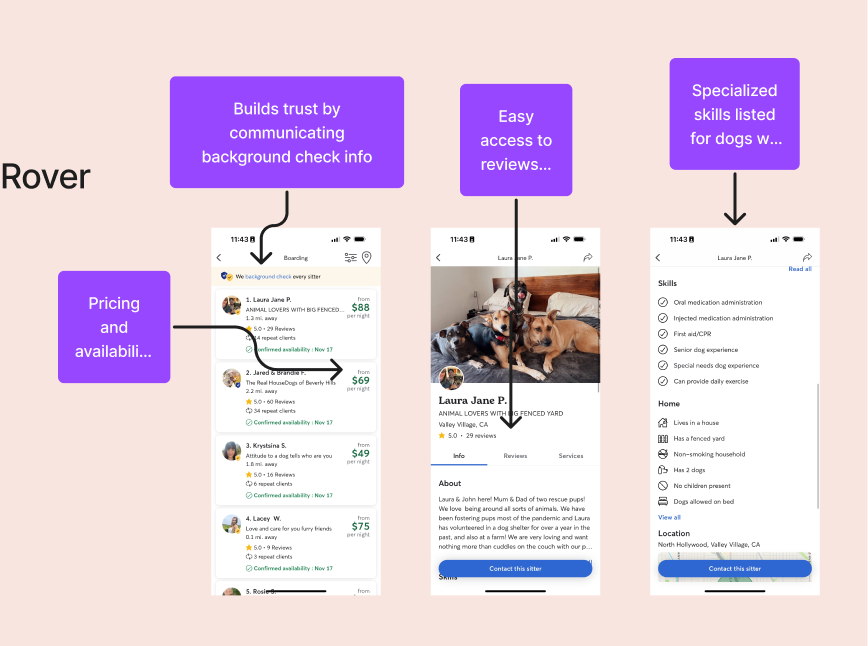
A quick round of competitive analysis was done to see how competitors implement (and build upon) some of the features that our user research participants had wanted from the Care Connect app.
Prioritization
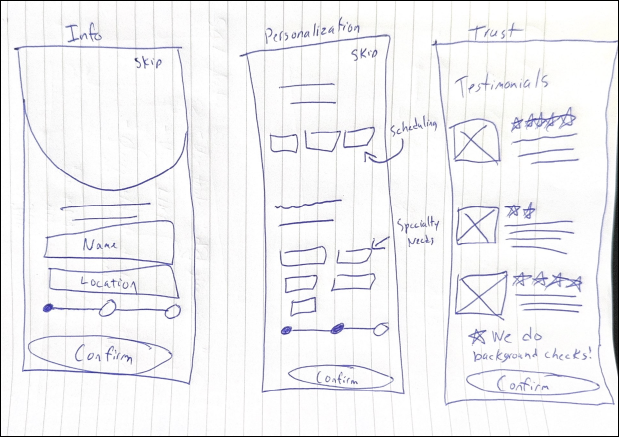
I decided to start by focusing on one of my rapid sketches that I felt had the most impact and user requested features.
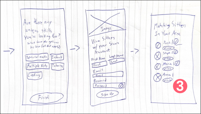
This sketch shows a sign up flow for a user that includes a more robust list of filters to add during onboarding, followed by a final page that shows other users reviews of the app.
I believe that this would improve the experience because it will allow users to be more granular with their specific needs during the sign-up process, thereby increasing conversion.
Detailed Sketch
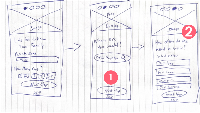
Next, I sketched a more detailed and slightly refined version of the design I choose from my rapid sketches.
Gives the user multiple ways to refine exactly what their needs are.
Gives the user the benefit of refining how often they would like to schedule a sitter.
A list of babysitters in the area that include their star rating and if they have been verified or not.
Hi-Fidelity Designs
User Pain Point #1
Other sites boldly display their work force to users to give users more confidence in who they hire.
User Pain Point #2
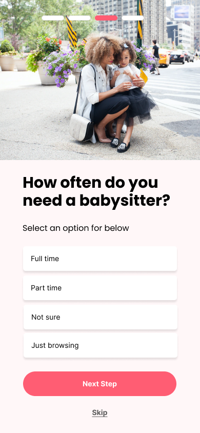
Users want to have more flexibility when it comes to scheduling a sitter.
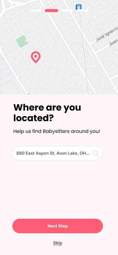
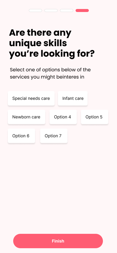
Then, I took my designs into Figma to create a more detailed version of the screens. My focus here was ensuring that all of the users major pain points and themes from the research phase were addressed during sign up. Below are the pain points and the associated screens that solved those pain points.
User Pain Point #3
Users want to be able to select multiple kids, as well as have a way to communicate their children's unique needs to a sitter.
Preference Testing
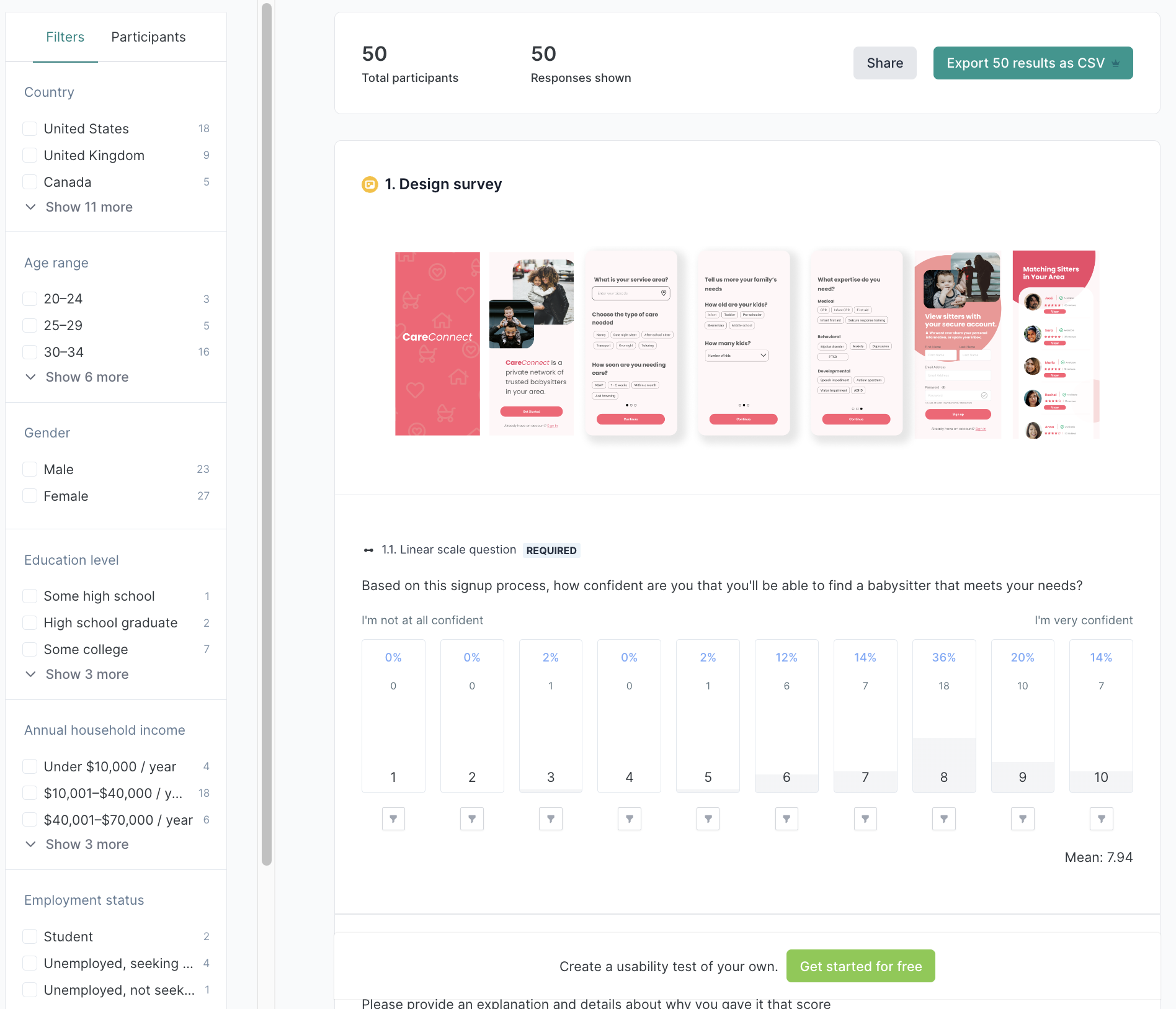
I tested (using Lyssna) my final design against the control version to get an idea if the newly created designs were better able to address users pain points.
Preference testing concluded with 30% higher satisfaction ratings with the overall flow when compared to the original control version.
“The layout is clean and every step is guided in a way that is easier for me to understand what am I doing.”
Key Takeaways
Here are a few key skills or takeaways I learned from completing this design sprint:
Less is not always more. Users would rather go through a few extra steps in a flow if it makes them feel more confident in the end result.
Working with a team of designers greatly increases the overall workflow and better helps keep the end user in mind.
A drawback of split testing is that, when only comparing two versions of a particular screen at a time, it can limit the exploration of other design options.
Next Steps
Here are some next steps I would take to continue to improve the CareConnect experience.
One thing I would like to finish is a fully functional date range selector so that users can get more granular with scheduling.
One thing I would like to test further is conversion rates based around the Sitter reviews. I want to see if removing this/simplifying this dramatically changes conversion.
One skill I would like to get better at is delegating tasks within a larger group setting.


