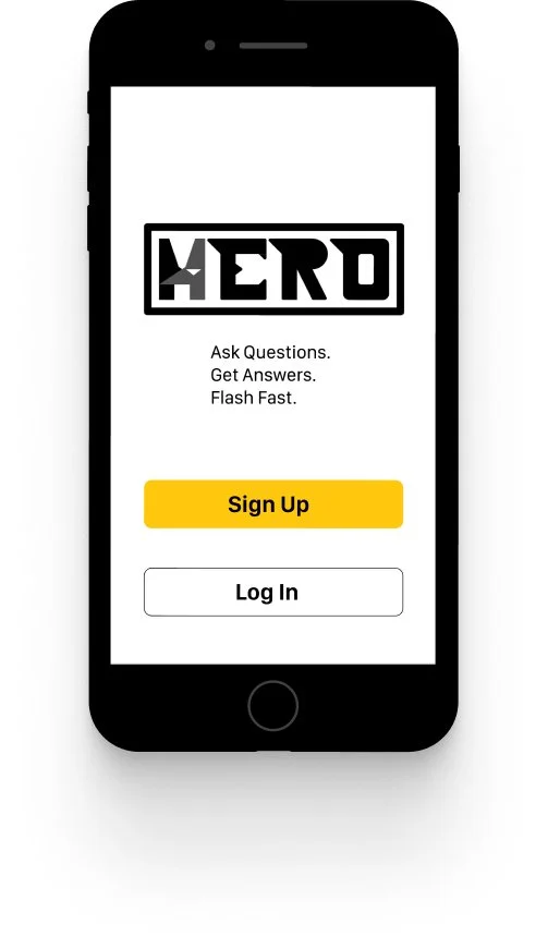
Hero
On-Demand Comic Book Knowledge
Project Brief
Enable anyone, anywhere to instantly chat with an expert in virtually any field.
Problem
In the comic book world, each comic contains a world of information that is hard to keep straight. This is a problem because a reader is expected to know all of the past history to enjoy the current storylines. Therefore, I hypothesized that avid comic book fans would need a way to pose questions to experts. We will know this to be true when a user is able to successfully have a question answered in a timely manner.
Team
Individual
Timeline
8 months
Role
UX Researcher, UX Designer, UI Designer
Tools
Figma, UsabilityHub, Balsamiq, Optimal Sort, Invision, Marvel
Solution
Create an app that gives comic book enthusiasts and newcomers alike on-demand access to a team of Heroes to answer any comic book related question, accurately.
Empathize
First and foremost, I began an informative user research period. The most important aspect during this stage was empathy and getting a real understanding of a user’s wants and needs for an on-demand comic knowledge app so that I would be able to address those and provide the user with a unique experience.
Sizing Up the Competition
I performed a competitive analysis base on what apps users are currently using to get an idea of each apps’ strengths and weaknesses. This would be crucial in helping me develop Hero and making sure that the user experience is unique.
Task Rabbit
Learnings
Membership is too expensive
Lack of granularity in categories
Service can be slow at times
Just Answer
Learnings
Heavy Instagram presence leaves out other age demographics
Freemium locks users out of important features
User Interviews & Surveys
Prior to development of Hero, I conducted a series of interviews to find out more about what potential users of Hero want from their comic related apps. Below is a brief summary of the research results.
Statistics
Number of Participants: 4
Average Age: 23
50% of participants were active comic book readers
50% of participants were novice comic book readers
Important Learnings
Users are more inclined to trust comic store owners for answers
Timeliness is a big factor when looking for apps to use
Forced payments. are not desirable, but being able to tip is a welcome idea
Being able to trust the knowledge source is key
Simplicity is preferred
Affinity Map Based on User Interviews & Surveys
Define
Next, I needed to pinpoint the end-user challenges that need to be solved. I needed to define who would be using Hero and why.
User Personas
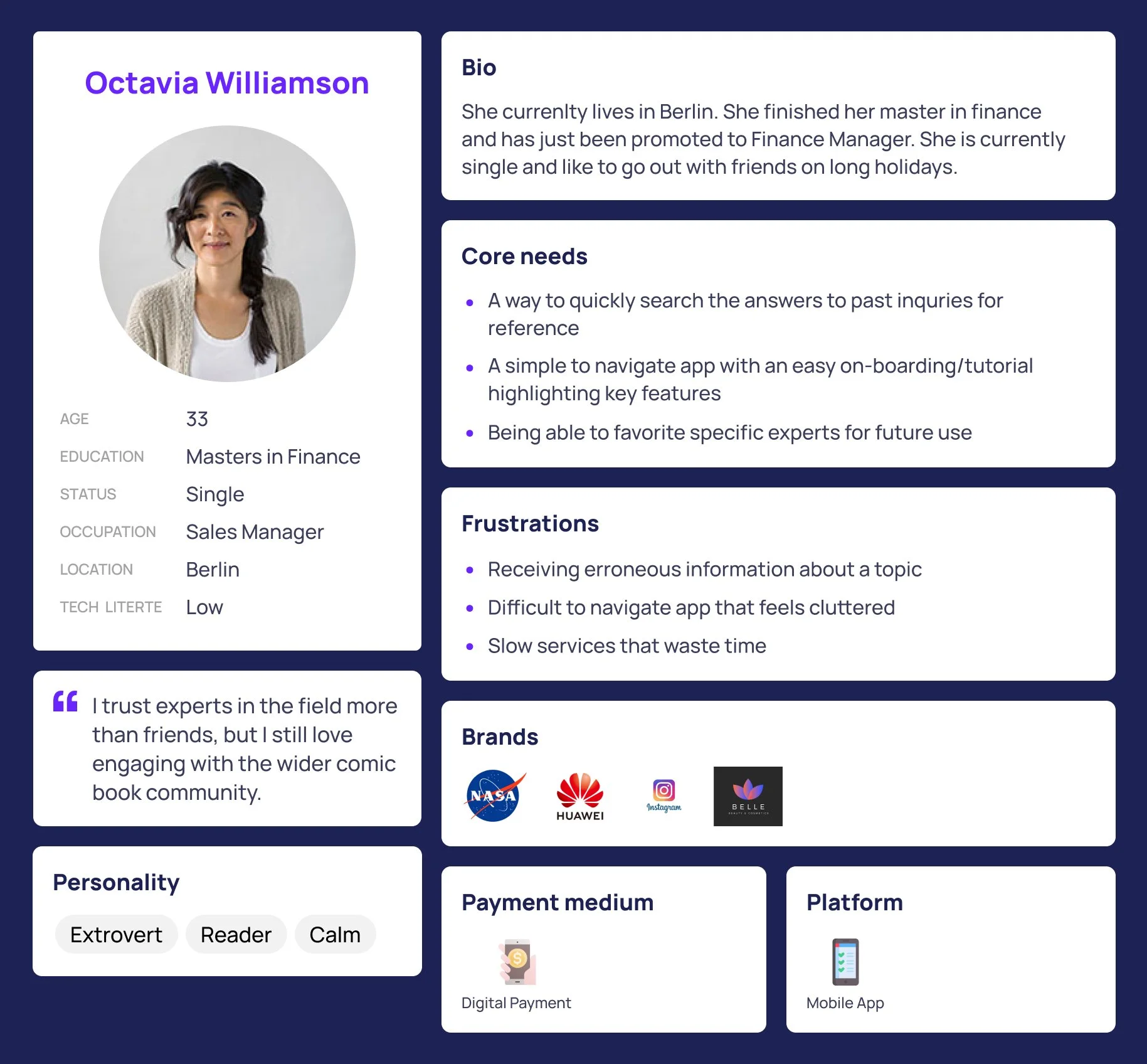
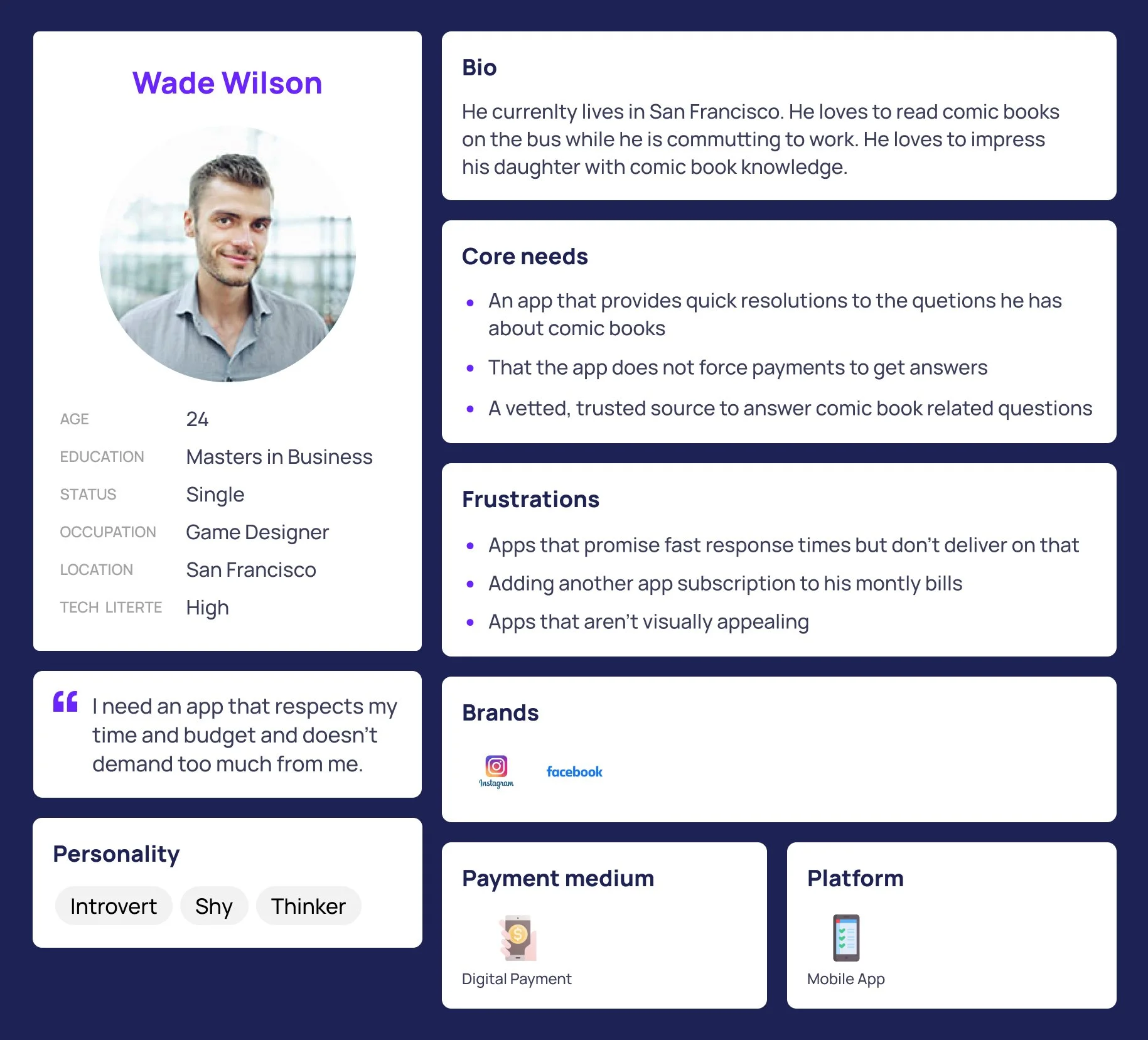
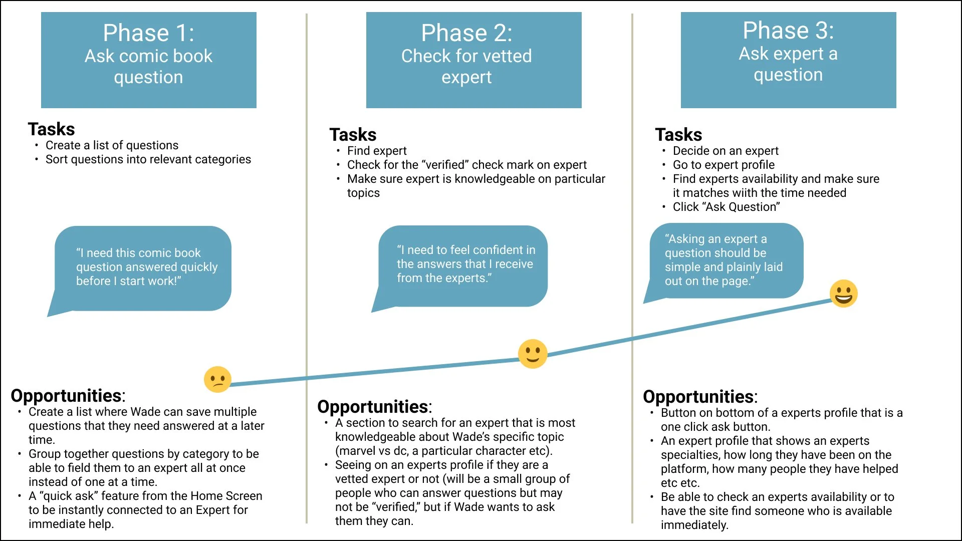
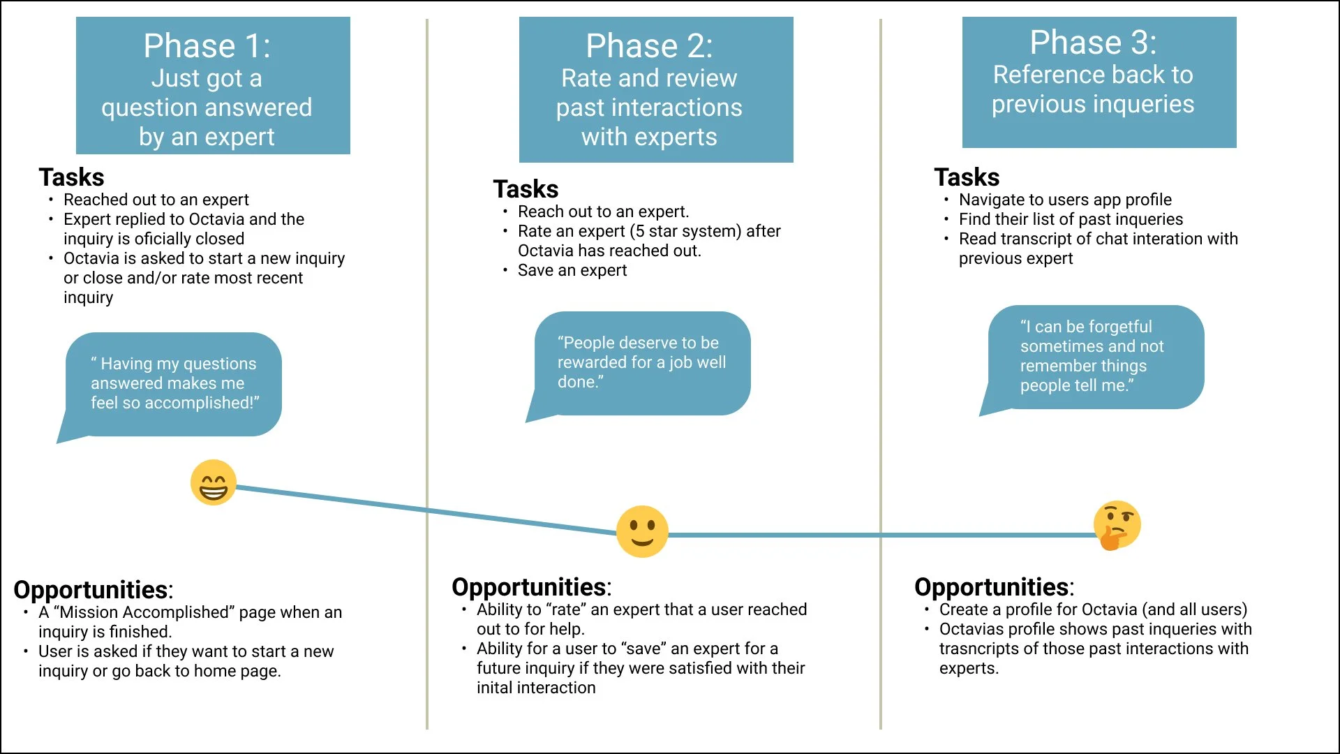
Based on the user interviews, I was able to create two user personas that I believe would represent who the Hero app would most appeal to. Octavia, who wants to talk about comic book-related things with her friends. And Wade, who needs answers quickly as he only has downtime while traveling to work.
User Journey
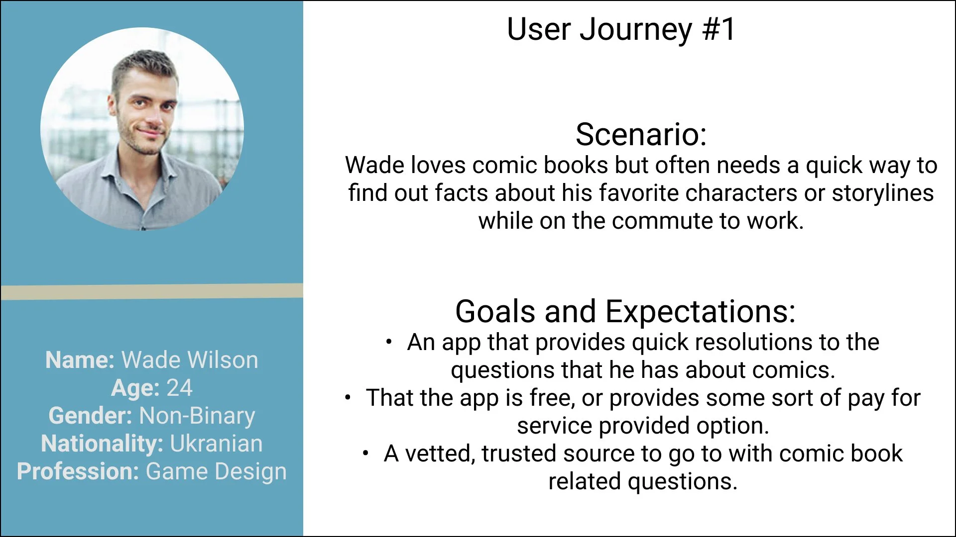
With my User Personas complete, I was able to create a User Journey for both Wade and Octavia which helped me to visualize the journey that each would take to accomplish a goal within the Hero app. These goals were created based on my findings from the initial round of user interviews.
Ideate
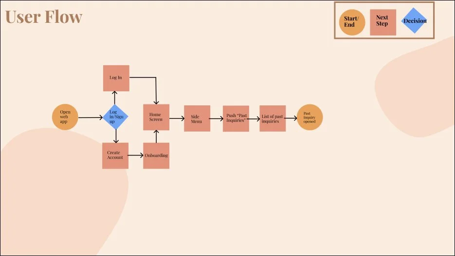
With the knowledge of who will be the end-user of Hero, and what challenges within Hero will need to be accomplished, I set out on creating User Flows and building out the Information Architecture.
User Flows
Wade’s User Flow Objective
As a young professional who doesn’t have much free time, I want to be able to ask comic book-related questions to an expert and receive quick and concise answers.
Octavia’s User Flow Objective
As a professional who can sometimes have a hard time keeping track of comic knowledge. I want to be able to go back into the Hero app and find past inquiries to refresh my memories.
Sitemap
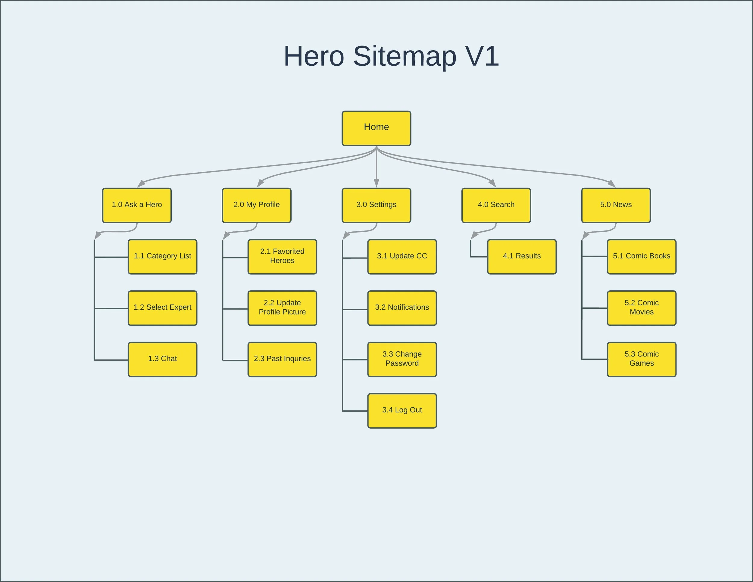
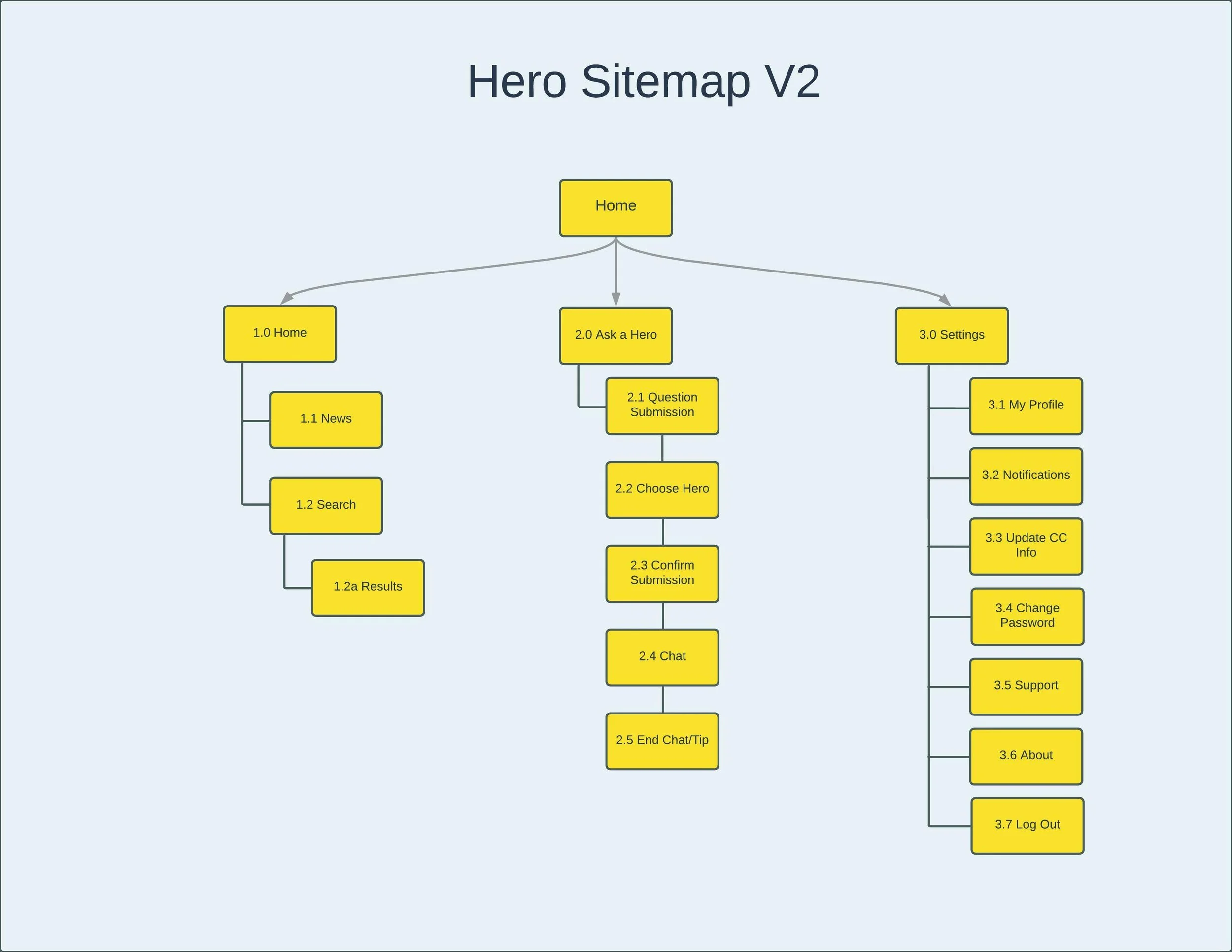
My initial sitemap had an information architecture that was in an Index Page format. I wanted the home page to be the main page where a user can access all other pages from. I conducted a closed card sort that helped me to build upon, and structure my site map. The sitemap did go through three versions before I landed upon the most polished sitemap with the data collected from my closed card sort.
The initial sitemap was too confusing for users during the card sorting. There were too many categories that felt overwhelming.
The revised sitemap condensed a lot of the extra categories and streamlined the user experience by having only three buttons on the main navigation instead of the previous five.
Prototypes
Now it was time to sketch out some initial ideas on how to organize the overall content of the Hero app and display foundational functionality using common design patterns and navigation systems for mobile.
Low/Mid-Fidelity Wireframes
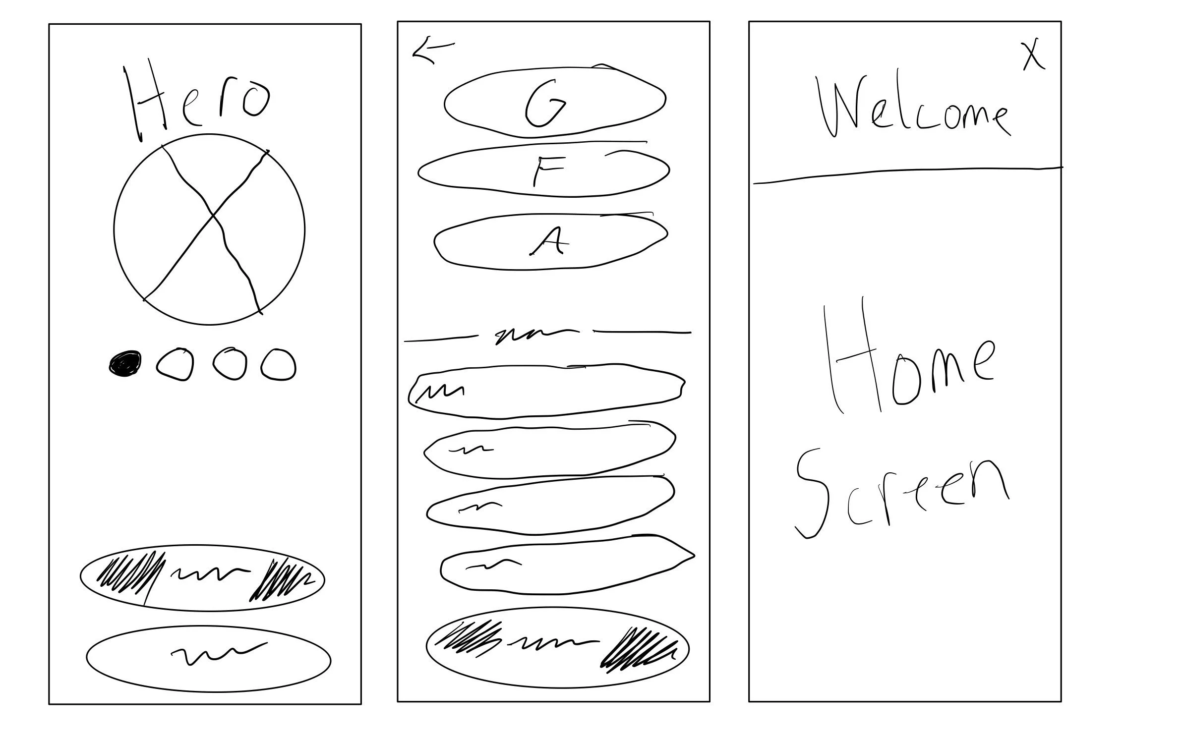
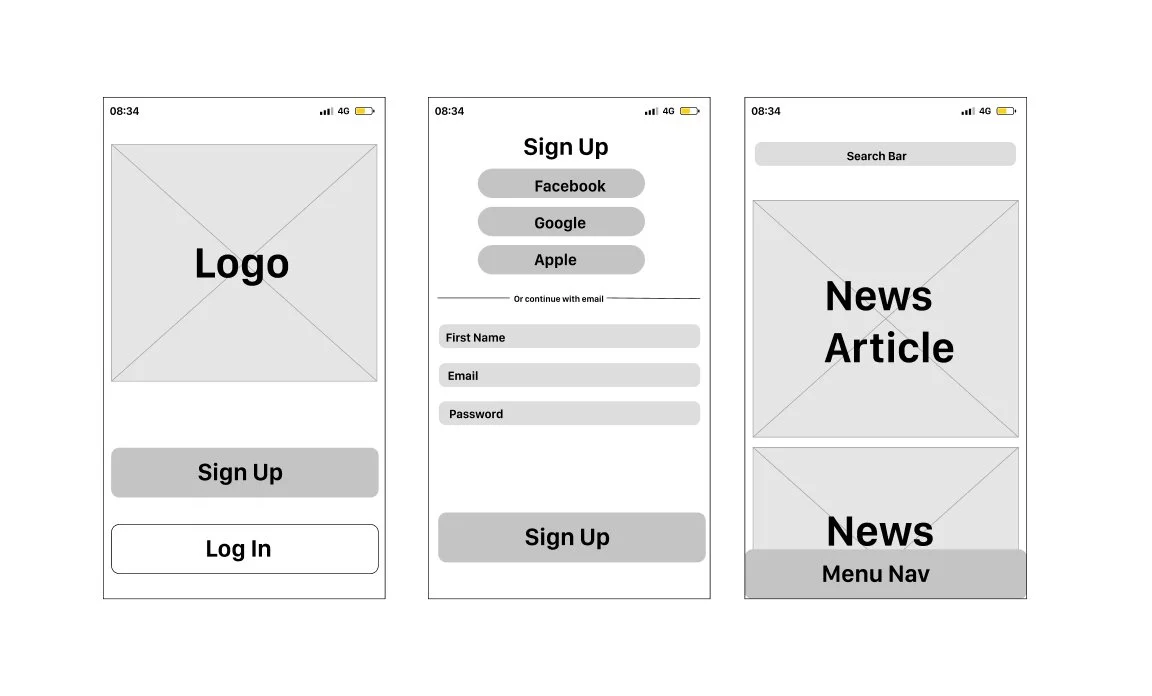
My first pass at low-fidelity wireframes was a quick way for me to establish how I want my pages organized. I then created initial mid-fidelity wireframes and then tested these wireframes with users to get some initial ideas on what might be working and what could be improved upon.
Low Fidelity Wireframes with a swipeable on-boarding section, a Sign Up page, and a “Welcome” banner at the Home Page.
Mid Fidelity Wireframes. After some considerations, I tweaked the overall flow to be more streamlined. I removed the onboarding from the first splash page as users sometimes skipped over it without realizing it. I also narrowed down the number of input fields from the Sign Up page to reduce cognitive load. Lastly, I removed the Welcome banner from the home page as user felt it was unnecessary.
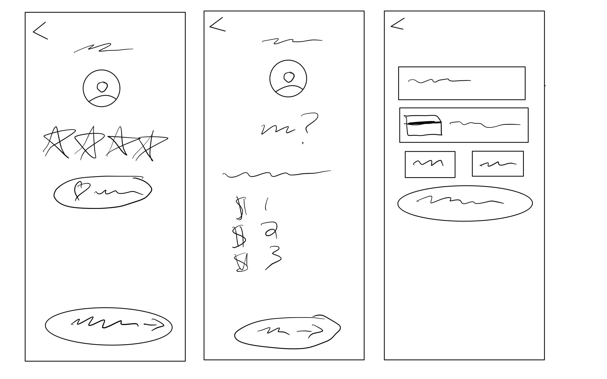
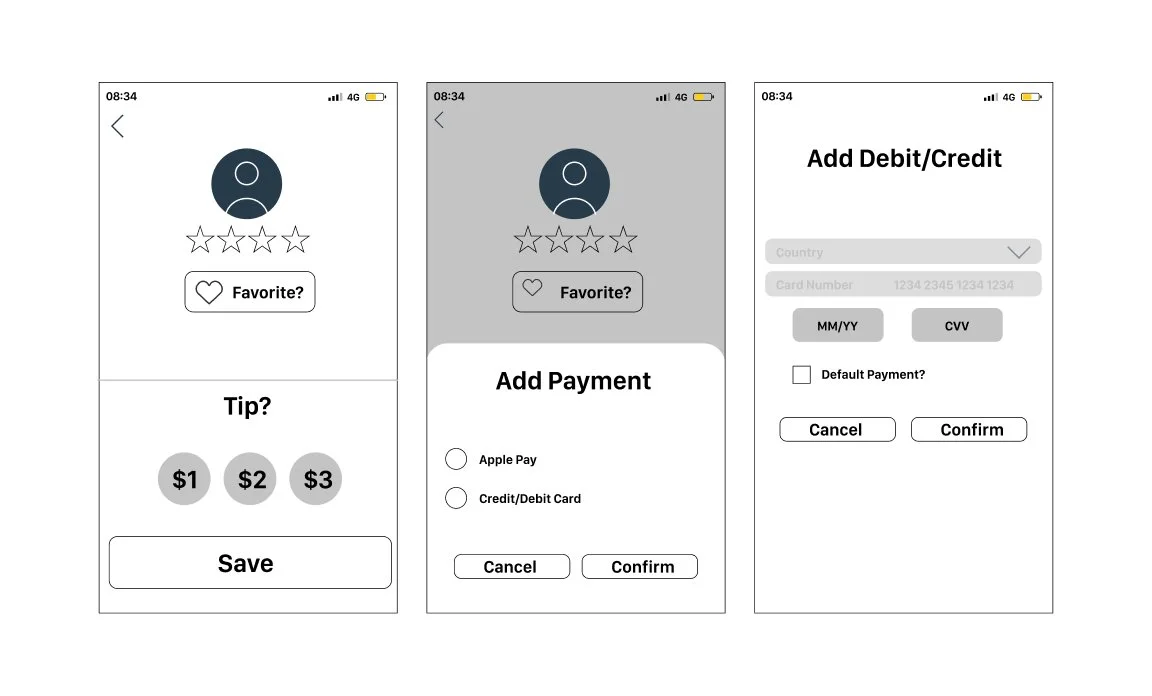
Low Fidelity Wireframes were broken up with Ratings on one screen, then tip, then card information.
Mid-Fidelity Wireframes updated to just include rating and tipping the Hero on a single screen, with payment information coming after.
Test
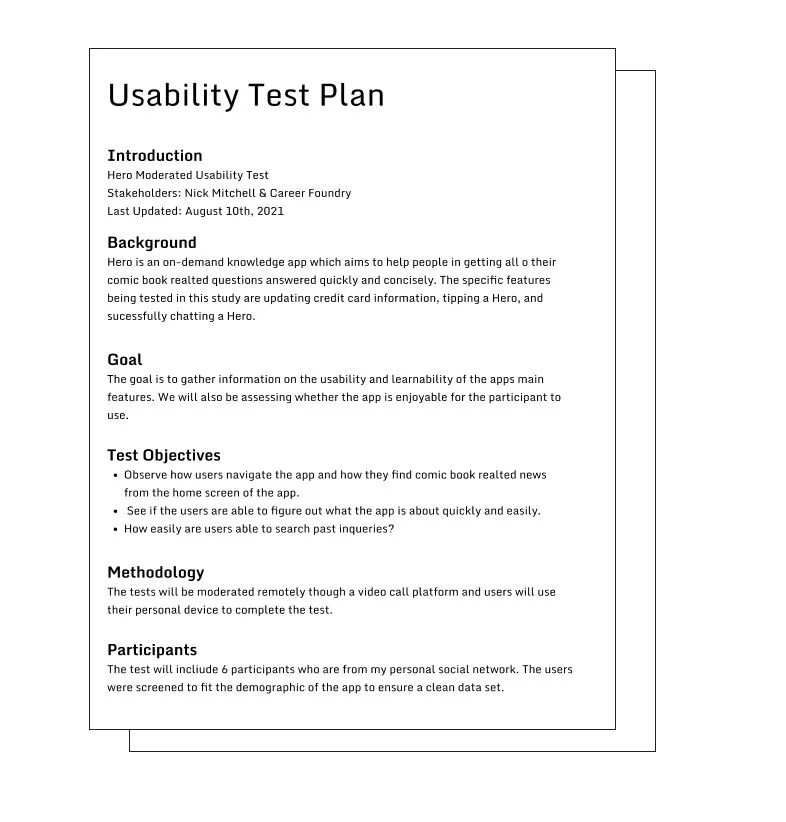
With my prototypes finished, I sent them out to 6 users to gather feedback on what works and what doesn’t work, and use that data to further polish the Hero app. I created a usability test plan and conducted moderate remote and in-person user testing sessions.
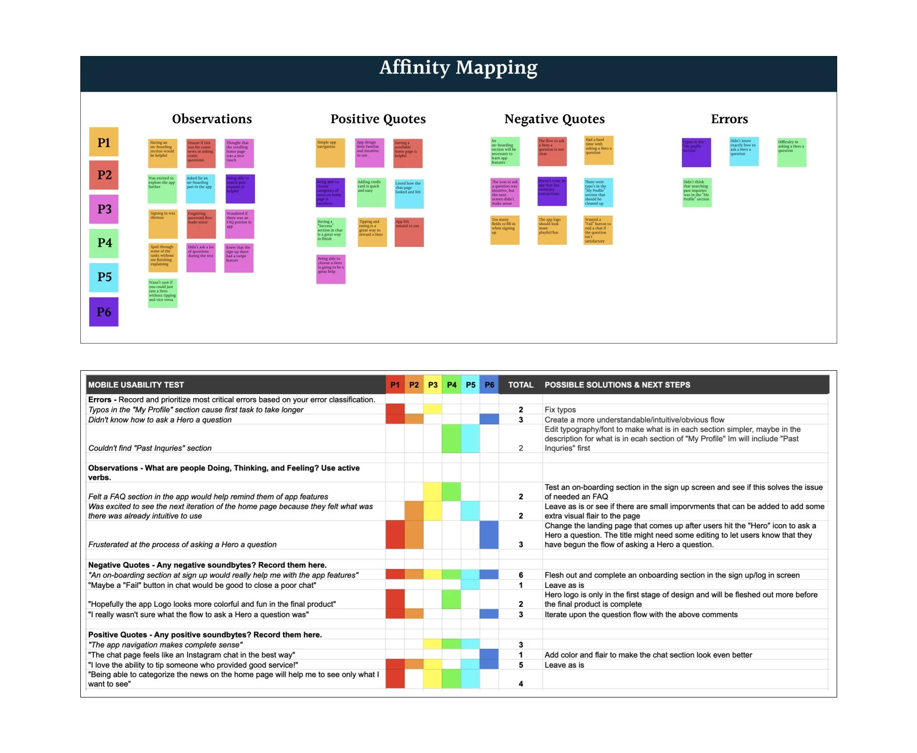
Usability Test Plan/Results
With my prototypes finished, I sent it out to 6 users to gather feedback on their experiences. I created a usability test plan and conducted moderate remote and in-person users testing sessions, analyzed the data, performed A/B testing, and further iterated upon the design of Hero.
A/B Testing
A/B testing helped me to further iterate upon my designs by giving users two versions of a flow and gathering feedback on which flow was preferred and why.
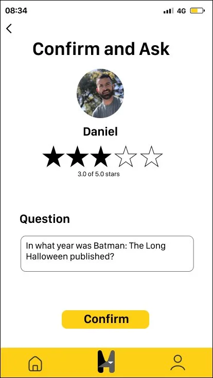
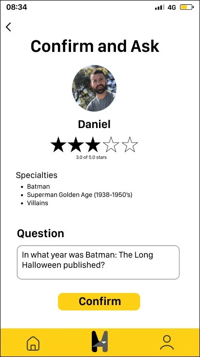
Users were given two different versions of the “Confirm to Ask” screen. The left screen was more streamlined and simple, while the right screen added information in the form of a “Specialties” section and a slightly more condensed layout. All users preferred the extra bit of detail that the right screen provided.
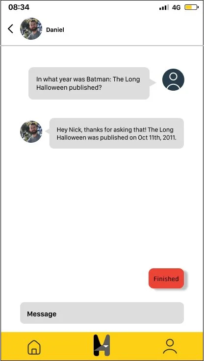
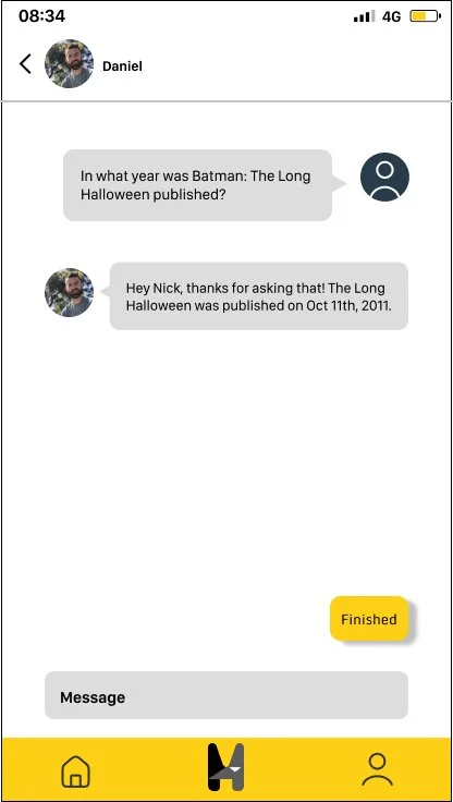
With the chat screen, I played with the color of the “Finish” button. The red version seemed like a visually easy way for the user to know that that meant to close the chat. The yellow I used to stay iconsistent with all previous CTA’s and the color story of the rest of the app. All users preferred the more on-brand yellow “Finish” button.
Refine
The final stages of the Hero app are upon us! Refining the app included some final sweeps of layout, spacing, and overall designs to make sure the final high fidelity prototype was as polished as possible. Design documentation was also finalized here for future dev handoff.
Design Documentation
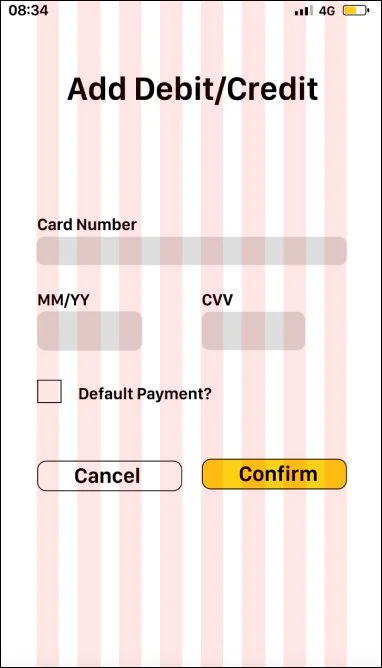
Grids & Spacing
Grid Layout
Column Grid - 8
Margins - 40
Gutters - 20
Language Guidelines
The voice is friendly, natural, and informative. The goal is to offer quick and concise answers to users with an emphasis on simplicity.
Do’s & Don’ts
DO use superhero puns where appropriate
DO keep the voice positive and friendly
DON’T use overly serious or wordy language
DON’T use graphically violent content
Challenges
One of the biggest challenges for this project was finding the human resources to gather feedback on the app. Finding people willing to be interviewed, setting up times, and being able to accurately take notes while conducting an interview was where I learned the most during my time working on Hero.
Grids & Spacing was also an area that I didn’t think had as large of an impact on an overall design as it turned out to be. I initially had a rough estimate of spacing and grids when I started, got halfway through the project, and realized that not having these rules listed made my design not look as clean as it could have. So I went back and fixed everything, but will absolutely be documenting these things beforehand in the future.
What does the future hold?
Continue testing new data based on quantitative and qualitative feedback
Further, deepen the social aspects of the app (comic book club read along with friends, allow users to share what they are reading to their socials etc)
Continued A/B testing on various sections of the app to continue to improve overall usability.
Continue to increase accessibility options for all users.

